

Incarts is a platform that helps businesses create and manage shoppable links, products, campaigns, and analytics for their digital presence. The platform empowers marketing teams, agencies, and brands to centralize their workflows — from uploading products to tracking cart performance — in one place.
This case study focuses on improving navigation, onboarding, and user clarity within the product’s early-stage design.
To refine the in-progress Figma designs by: Improving navigation naming conventions and ordering.
Establishing a first-time user onboarding flow that guides setup.Enhancing the dashboard and analytics distinction for clarity.
Ensuring the design incorporates branding consistency (colors, images, typography).
Created a clear onboarding checklist for first-time users.Defined navigation updates with intuitive names and ordering.
Established dashboard clarity: “What you want to do” vs. “What you need to know.”Integrated branding (blue #4774C4 + white) and real images.
Proposed analytics filters and KPIs more relevant to users.Delivered a Figma prototype ready for testing with real data.
The initial draft designs provided a good foundation (clean style, navigation framework) but lacked:
Onboarding is critical: Users need a guided setup (like LinkedIn’s “Profile completion %”).
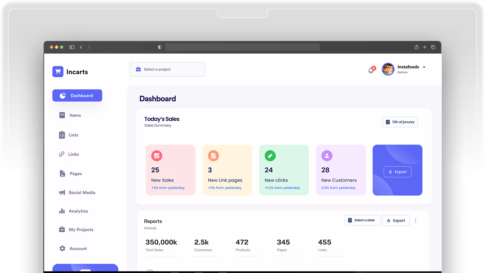
Navigation names matter: “Items” felt vague → “Products” is more intuitive.
Dashboard vs. Analytics: Dashboard = action-oriented (“What to do next”), Analytics = deep-dive data.
Campaign visibility missing: Agencies want to filter/manage links per campaign.
CSV uploads confusing: Non-technical users may not understand “CSV” → should say “Upload Products.”
Alerts need visibility: Users frustrated when links break or go out of stock without being notified.
The design evolved across three key pillars. Navigation and menu structure were refined by renaming “Items” to “Products,” “Links” to “Manage Active Links,” and “Social Media” to “Social AI Hub” (hidden until live), with the proposed menu order aligned to the user flow: Dashboard → Products → Lists → Links → Pages → Analytics. The first-time user onboarding flow now follows a step-by-step checklist: create a user account, create a project, upload products, create lists, create links, set up shoppable pages, launch Social AI campaigns, view analytics, invite collaborators, and refer a friend. Finally, dashboard refinement includes a “Want to Do” section featuring the onboarding checklist, broken links, options to add or manage items, and tutorials.


